Weather Watch
Printer friendly, pdf version
Background:
The weather is a key factor in the success and survival of the scientists
in Antarctica. We all pay attention to the weather every day, but
on a much more casual basis. For the team in the field, it can mean
a good day of gathering data or a delay in their progress. It can
mean life or death in such an unforgiving environment. The team reports
the daily temperature in their logs. The data is given in both Fahrenheit
and Celsius. Discussing temperatures during the expedition is a good
way to work with negative numbers in a real setting.
Activity Ideas
Line Graph to Compare Temperatures
Begin by asking the students what a good graph needs:
| Title |
|
Data |
| Labels for x and y axis |
|
Keys when necessary |
| Consistent intervals |
|
Straight edge lines! |
-
Use a line
graph to compare the daily temperatures given by the scientists
in Antarctica to your local area. Using a line graph will compare
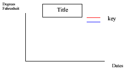
changes over time. Set the graph up so the x axis is the date
and the y axis is the temperature. (See fig 1) Use the entire
expedition or choose just a portion to graph. Use 2 different
colors for plotting and connecting the lines: one is local and
one is Antarctica.
-
A good source for your local historical temperatures is www.wunderground.com
Type in your city for the fast forecast. At the bottom of the
conditions box you will be able to get the historical information.
-
Ask the
students to predict the range of temperatures. With some historic
information, you can guide them to a reasonable range for the
graph. You will need to determine the range for your graph depending
upon your local temperature’s range during this period.
You can expect the Antarctic temperature to go no lower than –50
degrees. In fact, last year the lowest temperature Fahrenheit
was –13 and Celsius –28.
-
Next determine
the interval for the y axis. This will depend on the type of graph
paper you use and the range that is chosen.
-
Have the
students choose 2 colors for recording and make a key on the graph
to show what each color represents.
-
OPTION
Keep a poster sized graph on the bulletin board and have students
take turns retrieving the data on-line, recording on the poster,
and reporting to the class.
Comparing Celsius and Fahrenheit temperatures
-
Instead
of using your local temperature as above, record the 2 temperatures
given on the logs, Celsius and Fahrenheit. Follow the steps above,
substituting this data instead of comparing 2 places.
-
When determining
the range, consider the lows as stated above. The highest Fahrenheit
temperature last year on the continent was 30 degrees and Celsius
was –1.
-
There is
some inconsistency in the temperatures given as well as an occasional
mistake. See if the kids can catch them! For example, -16°C
was recorded as both 4 and 3 degrees F. Discuss why this might
be so. A website for good background is:
http://inspire.ospi.wednet.edu:8001/curric/weather/fahrcels.html
You might want to try a lesson on converting between Celsius and
Fahrenheit. A couple of web lessons available are: www.aaamath.com
. Under Math Topics go to Measurement then to Temperature Conversions
from the list of choices, and www.teachervision.com
. Go to Mathematics under subject area then type in Fahrenheit
for the search. The lesson is “Celsius and Fahrenheit Conversions
Made Simple.”
Notes:
-
The team’s
first entry was on October 30. The team plans to be back at McMurdo
on Jan 1 or 2.
-
The first entry from McMurdo was 11/2. The previous are from New Zealand.
-
There will
be days when the team does not file a report or no weather information
is given. Show this by a break in the line.
-
There is
an 8 X 14 graph paper available that will allow the entire
expedition to be graphed on one page.
-
The temperatures
from Antarctica are given when the logs are written. Use a constant
in your local area, such as the high or low for the day.
Figure 1